• Products
  • Services
  • About us
  • Blog
Trends 15 May 2026

Ceramic trends for 2026: the key trends anticipated by Cersaie 2026

Kerafrit

Written by

Kerafrit

Share

Updated 2 September 2026

There are colours that manage to capture a moment. For 2026, Pantone has chosen ‘Cloud Dancer’, a soft white that the brand associates with calm and which serves as a versatile base for creating other colour combinations.

It is not difficult to link this choice to what we are seeing in ceramic design. Natural tones. Materials that invite you to get closer. Matt finishes. Stone, wood and clay reinterpreted with ever-increasing realism. Spaces where we seek to slow down and feel at ease.

But the ceramic trends for 2026 go beyond a specific colour palette. They tell us how our relationship with spaces is changing and what we expect from the materials used to create them.

With just a few weeks to go until Cersaie 2026, which will be held in Bologna from 21 to 25 September, these trends offer a glimpse into some of the directions that will shape the conversation around design, materials and ceramic surfaces.

Ceramic trends for 2026 point to new ways of living

When the way we live changes, so does the way we design. The home has become much more than just a collection of rooms. Increasingly, consumers want spaces that help them switch off, that can be transformed depending on the time of day, and that convey a sense of something to those who live there.

That is why many of the ceramic design trends for 2026 share a common origin: the search for calm, authenticity, a connection with nature and greater freedom to personalise spaces.

The analysis by ASCER (the Spanish Association of Ceramic Tile and Flooring Manufacturers) points precisely to this relationship between ceramics and new ways of living, linking the material to issues such as nature, wellbeing, personal expression and flexibility in the home.

This also changes the way we understand a surface. We no longer simply choose a colour or a pattern; we consider how it responds to light, what sensation it creates to the touch, how it interacts with the materials around it, and what emotion we wish to evoke with it.

“A trend isn’t validated simply because it looks good digitally. It’s validated when the surface retains its intended purpose after the manufacturing process.” – Eloy Quero / Head of Design – Kerafrit

Geomatter: earthy colours and surfaces that reconnect us with nature

Looking to nature for inspiration is nothing new. What has changed is how we interpret it. Inspiration is no longer limited to reproducing a stone or using an earthy shade. We are interested in layers, sediments, irregularities, the traces of time and everything that makes a material seem alive.

This is where Geomatter comes into its own – a trend that translates geological imagery onto surfaces and finds beauty in strata, erosion, mineral matter and small imperfections.

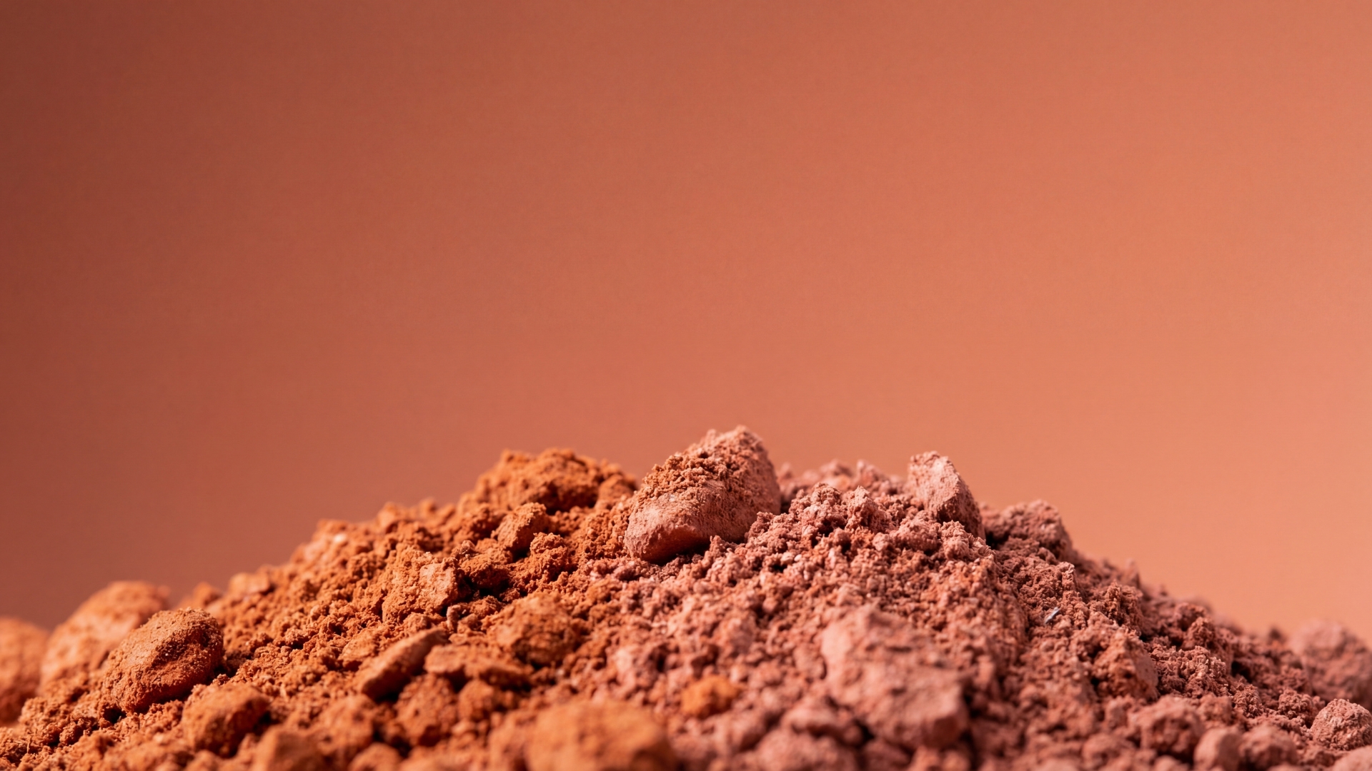
Earth tones, greens and terracottas

Terracottas, sands, clays, ochres, browns and mineral greens are gaining ground because they allow us to create warm atmospheres without being overly decorative.

We are not necessarily talking about intense colours. They often work best when slightly desaturated, mixed with beige, stone or warm whites. The result is a palette that stands the test of time and blends well with wood, stone, fibres and other natural-looking materials.

Green deserves special attention. From soft, greyish shades to deeper greens, it introduces a direct link to the landscape and helps to create spaces where the indoors and outdoors seem to merge.

Stone, wood and minerals

Stone and wood effects continue to evolve, but we are increasingly moving away from obvious imitations and towards a more credible interpretation of the material.

Fossils, veins, sediments and variations in colour appear in the stones. In wood, the grain is no longer perfectly uniform. On mineral surfaces, we find pores, subtle contrasts and variations that prevent the pattern from becoming too repetitive.

Matt finishes and irregular textures lend a sense of texture

Gloss gives way to more understated surfaces. Matt finishes, silky matts, micro-textures and subtle reliefs add depth without resorting to excessive effects. It is an aesthetic that appears simple, yet is technically demanding.

A good matt finish requires uniformity, stability and a controlled surface response. That is why, behind that sense of naturalness, there lies precise work in formulation and firing.

Warm minimalism turns the home into a sanctuary

For years, we have associated minimalism with white interiors, very clean lines and a certain visual coldness. In 2026, that interpretation softens. We continue to seek tidy spaces, but we want them to feel more human. Fewer objects, yes. But more texture. More substance. More natural light. A greater sense of comfort.

The home is increasingly seen as a refuge from a fast-paced world. And ceramics have a lot to offer because they allow us to create serene spaces without compromising on the practicality required for everyday use.

Neutral colours are becoming warmer and more enveloping

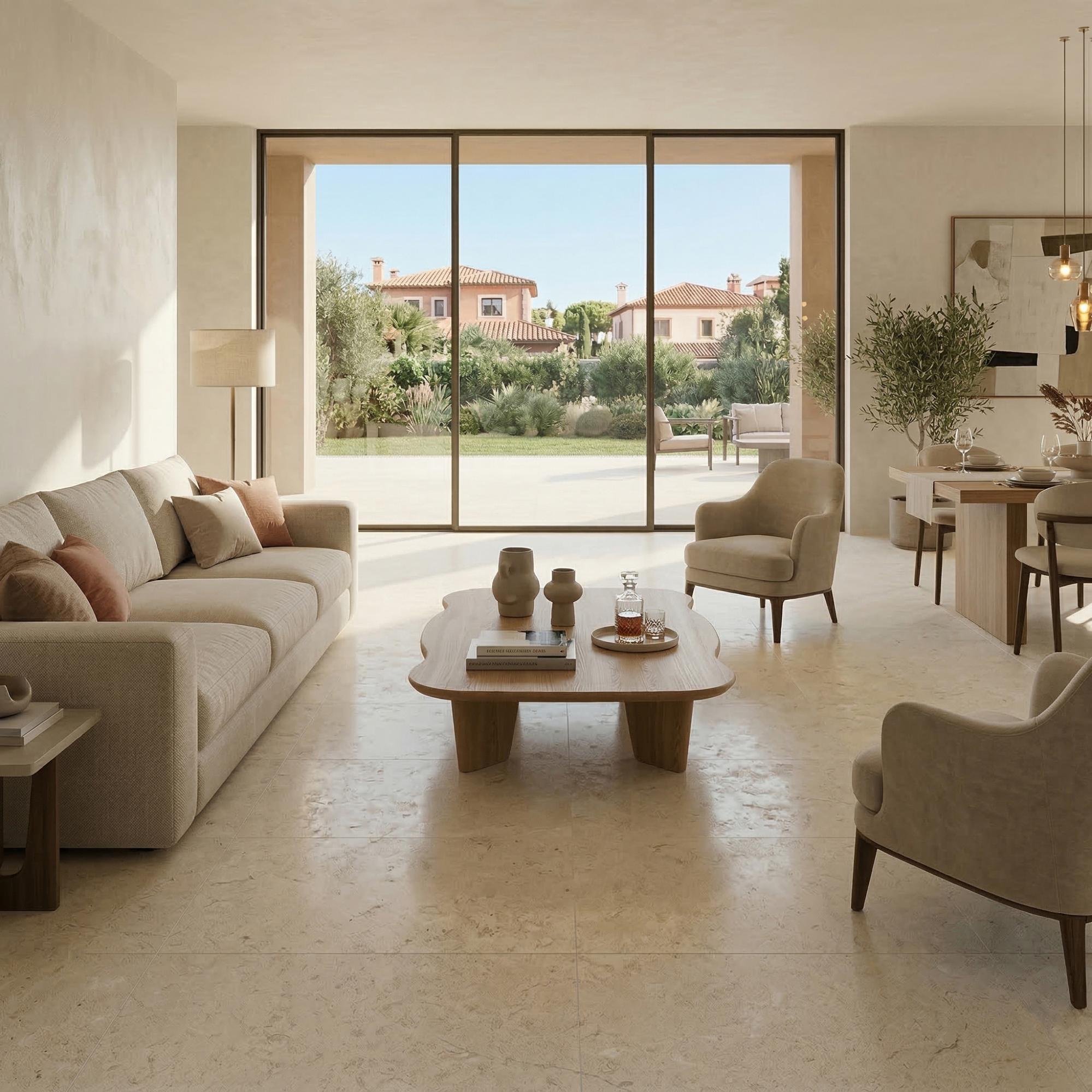
White isn’t disappearing. It’s evolving. Cloud Dancer perfectly illustrates this transition: we remain within the world of neutrals, but we’re moving away from clinical white towards softer shades that are easier to coordinate. Surrounding it are shades of beige, sand, cream, greige, stone and warm greys.

These are understated colours, but not flat. Their richness comes to the fore when we work with different depths, transparencies, textures or degrees of matt finish.

This palette also allows us to create highly versatile spaces. It can complement a Mediterranean aesthetic, a minimalist interior or a more rustic style, depending on the format, the design and the materials with which it interacts.

Matt, silky and tactile: the richness lies in the subtle nuances

When we tone down the prominence of colour, the finish becomes even more important. The same shade can feel completely different on a matt, satin or textured surface. The way light falls changes. So does our perception of depth.

That is why we are seeing growing interest in surfaces that do not seek to grab attention immediately, but rather reveal small details as we get closer.

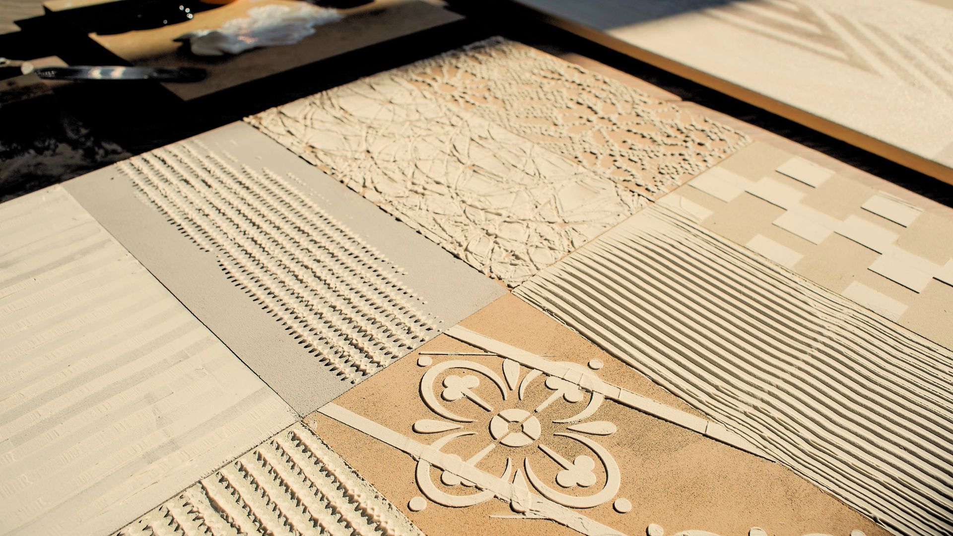
In this context, ceramic textures become a genuine design tool: they influence the tactile experience, the play of light and our perception of the material, but they must also be consistent and reproducible when put into production.

Hyper-realistic finishes take the surface one step further

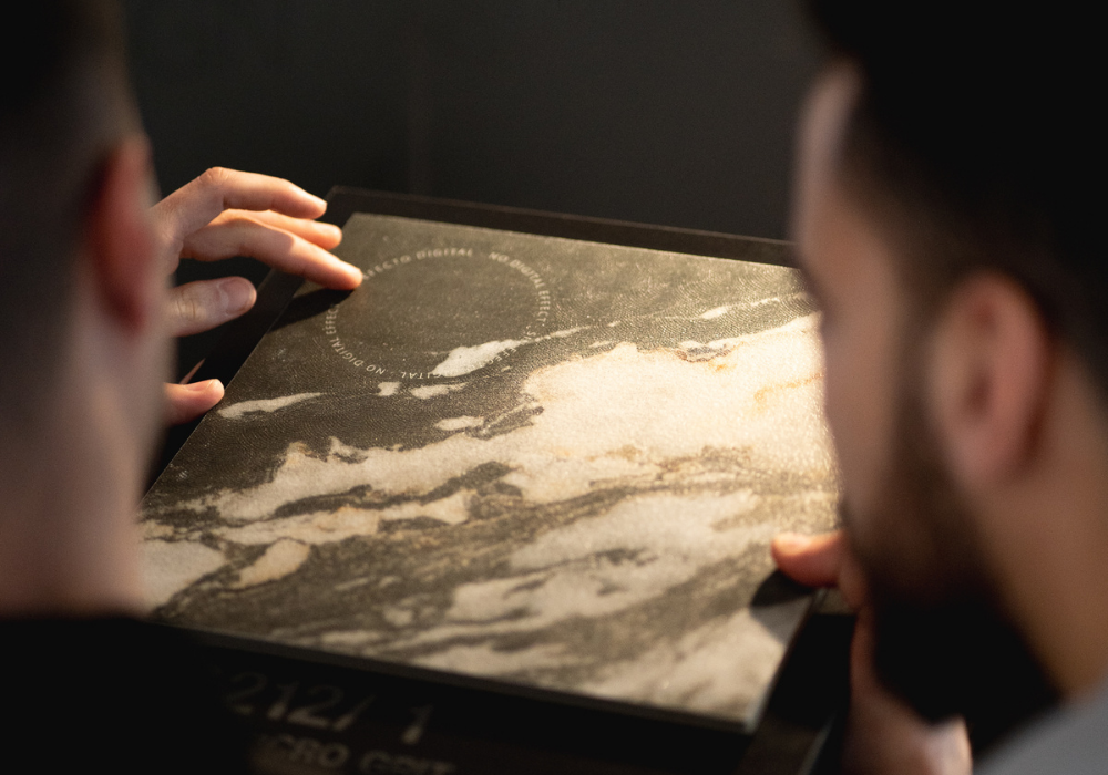
Faithfully reproducing stone, wood or a mineral material no longer depends solely on high-resolution graphics. The next level of ceramic hyper-realism lies in achieving consistency.

A grain has a direction. A crack creates depth. An eroded area reacts in a certain way to light. If the visual design says one thing and the relief tells another, the effect loses its credibility.

Graphics alone are no longer enough

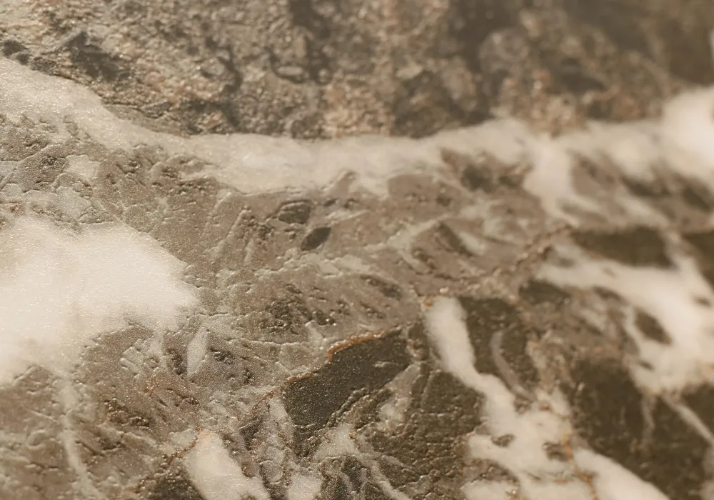
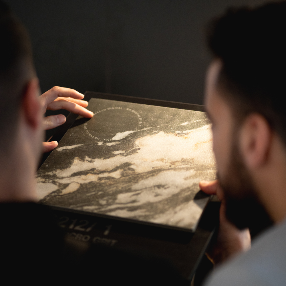
We can reproduce the pattern of marble with enormous precision and yet still feel that something is missing. The reason often lies in the surface. Natural materials contain variations in thickness, polished areas, tiny pores, inclusions, irregularities and changes in reflection. That information is not contained solely within the image.

To move towards hyper-realistic finishes, we need to interpret these details and decide which ones should be transferred to the piece. It is not simply a matter of adding texture for the sake of it. It is about understanding what texture that graphic requires.

The past returns to ceramics with a contemporary twist

Not all trends for 2026 seek visual simplicity. There is also a clear desire to bring back colour, decoration and elements capable of telling stories. After years of extremely uniform interiors, we are once again looking to styles of the past. Not to reproduce them literally, but to blend them, simplify them and adapt them to contemporary aesthetics.

Retro nouveau, cottagecore and castlecore breathe new life into spaces steeped in history

Although they stem from different sources of inspiration, these trends share something in common: they reject impersonal spaces. Firstly, retro nouveau revives geometries, colour and ornamentation through a modern lens. Meanwhile, cottagecore connects with the domestic, the artisanal and a lifestyle closer to nature. Finally, castlecore introduces historical references, robust materials and a somewhat more theatrical aesthetic.

In ceramics, these influences open up a wealth of possibilities. Small formats, distinctive patterns, finishes reminiscent of handcrafted work, or compositions where no two pieces are exactly alike allow us to draw on the past without turning it into a replica.

Large formats and geometric modules transform the composition

The format also defines how we perceive a surface and how it relates to the space. In the 2026 ceramic trends, two different yet complementary directions coexist: the pursuit of continuity through large formats and the use of geometric modules to introduce rhythm and character.
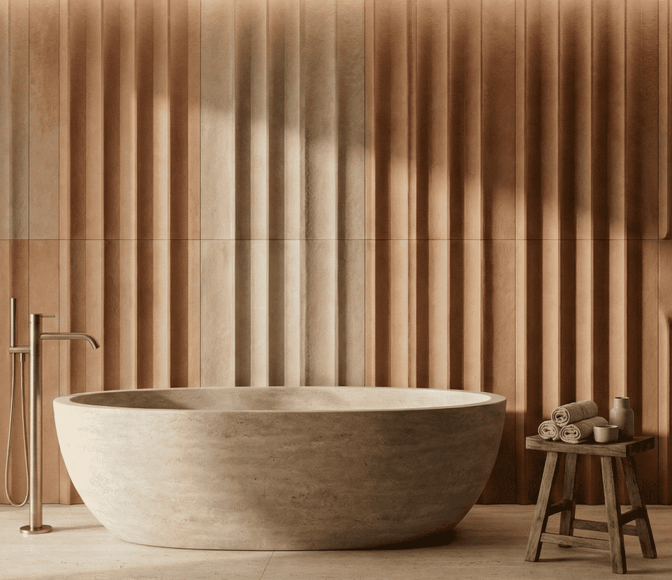
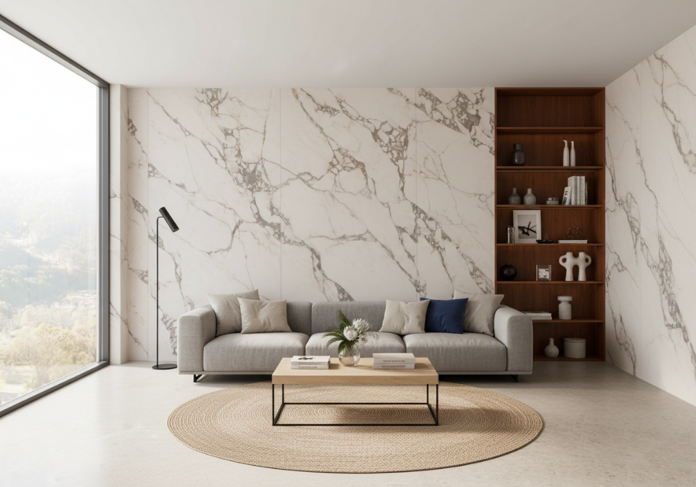
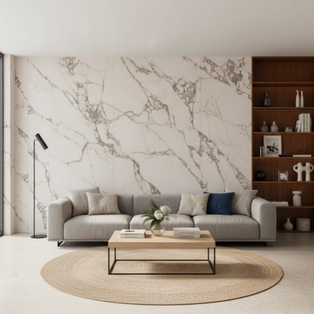
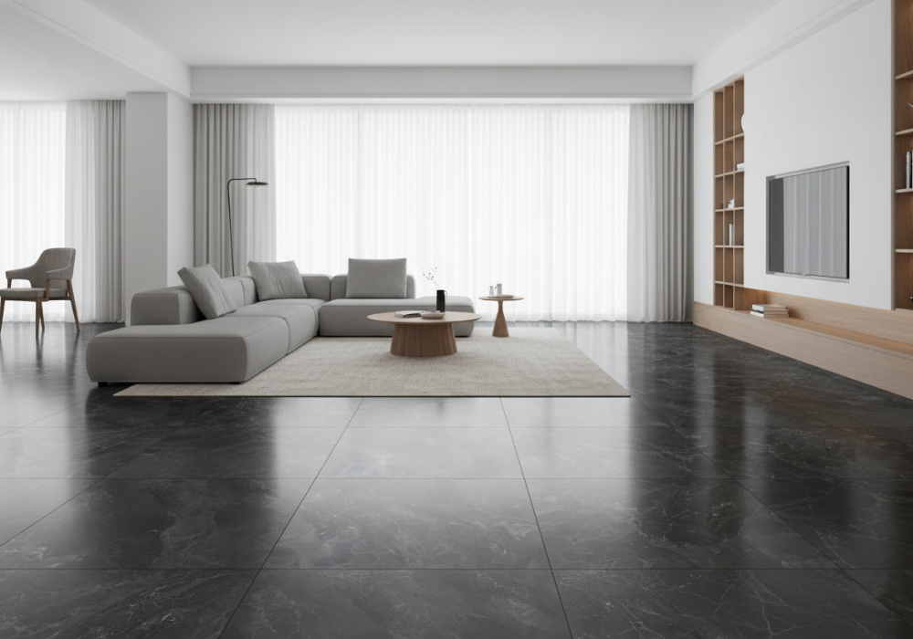
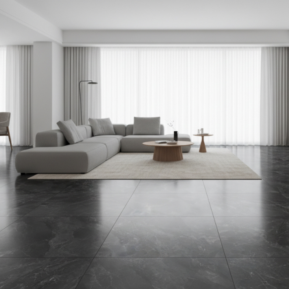
Large tiles allow stone, marble, wood or mineral-inspired patterns to be laid out across expansive surfaces with fewer visual interruptions. This creates more seamless and immersive spaces, where the floor, walls and even certain pieces of furniture can share a common aesthetic.

In contrast to this continuity, geometric modules reclaim composition as a creative tool. Small tiles, elongated formats, curves or modular combinations allow us to break up linearity and create patterns with more character. Geometry thus ceases to be merely a question of format and becomes an integral part of the surface design.

Versatile spaces: ceramics take on new functions

The way we live is also changing. Kitchens open onto dining areas, rooms no longer serve a single purpose, and the boundaries between spaces are becoming more flexible. This evolution fosters more connected interiors, where materials help to create continuity and visual coherence.

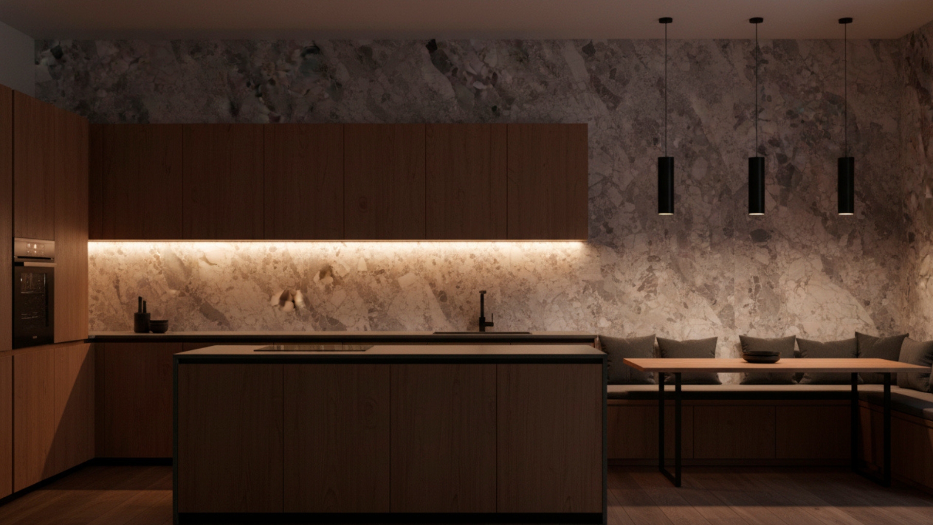
In this context, ceramics are extending their presence beyond floors and walls. Worktops, tables, furniture fronts and other integrated elements allow the same language of colour, texture and finish to be carried through to different areas of the space. A stone-inspired surface, for example, can run across the floor and reappear on a worktop or a piece of furniture, reinforcing the sense of unity.

From trend to surface: how to turn inspiration into a ceramic design

A mood board might start with a weathered stone, a photograph of a landscape, an antique fabric or a colour scheme. But between that inspiration and a surface ready for production, there are many decisions to be made.

At Kerafrit, we see trends as a starting point. They help us identify new styles and possibilities, but we don’t work to a set formula. Because the best thing we can do with a trend isn’t to copy it. It’s to interpret it together with you.

From there, we develop the idea, the material and the process together. We test. We fine-tune. We measure. We test again. Because there are no shortcuts in ceramics: every aesthetic decision has a technical consequence.

“Lasting innovation does not stem solely from technology. It stems from the connection between the person who envisions a surface and the person who knows how to make it a reality.” – Toni Martín / Head of Glaze and Ink Development – Kerafrit

Featured Articles

  • Inicio /
  • Blog /
  • Ceramic trends for 2026: the key trends anticipated by Cersaie 2026